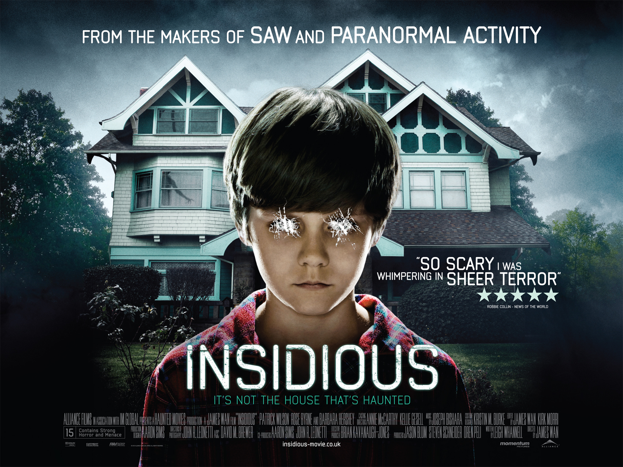
Wednesday, 16 March 2016

Looking back at you preliminary task, what do you feel you have learnt in the progression from it to the full product?

Overall I think I have made a lot of progression from the preliminary task as there is a definite improvement between the first task and the final product. The preliminary task was created in November when I was a new student to media studies. As I was a new student I had no previous experience with cameras and editing software therefore I was rather clueless to the subject never the less I was keen on learning it!
To start with our preliminary task wasn't thought out well enough. By adding as many camera shots as we could think of we thought the outcome would be better. However when looking back there was no need to use so many shots for the sake of it as it only left the audience confused to the meaning behind it. You can also tell the camera wasn't put on a tripod as you can see the person filming's hand begin to shake towards the end of the shot.
In general it didn't make much sense. We had shots missing, the actors were last minute hence why we had two girls playing the roles of both female and male, there are classic mistakes in it (in one shot the female actors hair is up then down and there is a slight change in clothing) and as we forgot to cut the music the clip carries on for 3 minutes. 2 minutes 50 without any footage. Overall we filmed for ten minutes on two different days, the days were not planned to film on, it was done on a day which was most convenient between us and the actors which ended up being at school lunch time.

The final product was a completely different story. me and my partner decided to get organised when doing this task, we made sure we had the right actor playing for the role, we went location scouting, had storyboards at the ready and had also researched similar movie openings and the phobia itself. I think the fact that we were not under strict instructions to follow a script and film in certain locations gave us the confidence to make something original and what we thought would be seen as unpredictable. Even when editing there is a big difference in the first each clip has been cropped together with a song as the background whereas when we were editing The Agoraphobic we had to play around with sound, lighting, colours etc. Overall I feel that I have defiantly learnt a lot from the preliminary task which can be clearly demonstrated in the final cut.
What have you learnt about technologies from process of constructing this product?

Technology
Process of constructing
Camera/ Lenses
To film the footage for our film opening we used a Canon 700D instead of the schools common Canon EOS 550D the reason being that the camera we used was a newer model meaning clearer footage which would have more of a professional outcome. As the camera wasn’t mine I hadn’t had much experience with it, so when we first started filming I was a bit clueless on what settings to put the camera on and why. However, further on in the filming process my partner Cordelia showed me how to use the settings on her camera and gave me the chance to start exploring with her camera and learning about the different features of it on my own. For example, I learnt about the ISO settings and how you need to change it with different lighting otherwise it’ll ruin your footage as It may look too dark/light or orange/blue.
 We also used a variation of different lenses such as a 60mm for close up, 75mm for an extreme close up and a 18mm to explore different angles, I learnt from using the different lenses what they are and what lenses you need for the different roles of shooting. But most importantly I learnt that you need a mixture of lenses when filming to enable the film to flow nicely instead of just having the same still shot through the same lens.
Mac/ Final cut pro
Once we finished filming everything we needed it was time to face the daunting task of uploading and editing on Final cut pro 7. As I haven’t had much experience with using a mac and final cut pro I was nervous to start adventuring around with it but once I started having a play around with it I learnt that perhaps it isn’t so hard to get the hang of it.
Tools
In final cut pro we discovered lots of new tools which contributed to making our final piece what it is today. The tools which we used regularly during editing was the razor blade tool. The razor blade tool created a straight cut at a precised time.
 One of the main issues we had when editing was dealing with music we had chosen. As our original piece of music was found on a royalty free site for online music streaming the music we had chosen was under the genre of ‘Sci-Fi’ the reason why we decided to go with this piece of music was because there were parts in it which we thought really suited our film however there were also other parts where the music started to go into Sci-Fi with the high pitch striking notes. We knew this was going to be a challenge when editing but we decided to take it on as it was the closest thing we found to what we were looking for. To get the music to sound as normal as possible it was a matter of trial and error. We had to keep replaying the music and cutting it where we think it should end and then joining it up with another part of the song. However, the problem with this was it started to sound jumpy, I then discovered to solve this I would need to use the pen tool to sort out the sound which I then lowered near the end and beginning of the cuts to make them flow into each other. In some parts it didn’t work as well as others but you can say it adds to the jumpiness of his agoraphobia.
At first me and my partner thought it would be a good idea to add sound effects in. As much as sound effects are useful and can create enigma of a piece we found it a challenge to find the perfect sound effect for example pills dropping on the floor. It only took us to when we nearly finished editing that why don’t we add the official sound to the recordings. It will sound realistic and most importantly will be in time. We learnt that working with what you got instead of adventuring out can sometimes work better!
 Colour grading
As I haven’t used final cut pro much before I didn’t even know you could colour grade but after my teacher suggested it as he said that colour grading is used in lots of TV shows/ movies to make you establish the genre without even realising, for example made in Chelsea has a pastel filter to it which tells us that it is a girly reality show. After looking at examples of colour grading as we weren’t familiar with it we then thought it would be perfect for us to use in our film opening. However, I didn’t know how to colour grade so I had to research online on how to do it.
How to colour grade
Filters-video filters-colour correction- then drag the colour palette to what colours/tones you want it to have
 With using colour grading we then started to make the scenes look dark and colour less to fit in with the genre of thriller, colour grading was fairly easy once we knew where to find it on final cut pro.
Blogger
I had to use Blogger to blog everything that went behind making and contributing to the final product. Before I made a Blogger account I had briefly heard about it and how big the software is in the blogging world therefore it was defiantly going to be the site I was blog on over WordPress and other blogging sites. It was stressful at first to get my head around as there was so many things I didn’t understand and didn’t know how do but after watching a few short tutorials on YouTube there was no need to stress I started to learn things like how to insert videos, a sound cloud recording, pictures and animations. It was easy to use which only took little bit of common sense to get the hang of it
Prezi
Unlike blogger Prezi was frustrating throughout the whole process everything about it was hard and frustrating to use, I think in general if you haven’t got the premium edition it won’t be as good as you are limited on the settings to use and information to put on, nether the less I wanted a different way of showing information, which I ended up achieving. However, I couldn’t display the Prezi as a mini clip as I didn’t to buy the soft wear to do this so I ended up taking screenshots of it to present that I have done the work.
Creating a podcast
To create a podcast, I figured out that you need to make a voice memo on a standard iPhone (the only issue I had was that I couldn’t end the podcast until about 10 seconds after I had finished as I had to unlock my phone) I then uploaded it to Sound cloud as other podcasting site wouldn’t work. It was rather simple to upload but the hard bit was embedding it onto blogger.
Copy-paste the embed code from 'Code & preview'. Next, copy the code and paste it into the HTML editor section of your site’s editor.
After I followed these instructions I learnt how to embed It onto blogger.
Converting final cut pro onto YouTube
To convert our final piece onto final cut pro we had to follow to simple instructions:

1.         After completing your video editing, open Final cut pro window.
2.         Go to “File” option on the option Bar.
3.         Then go to “Share” option.
4.         Then select “Master File”.
5.         A small window will appear on the screen with Option “Info” and “Setting”.
6.         After clicking on “Setting” a menu will appear; you can select format for your video.
7.         After this again go to “File” option and then go to “Share” button.
8.         Click on “YouTube” to upload and get and output file simultaneously.
9.         Sign in to your YouTube account by Clicking on “Sign in”.
10.       Then go on the “Next” button.
11.       On next window Click on “Publish” to upload your video.
12.       Open YouTube directly into your web browser.
13.       Get signed in to your account of YouTube.
14.       Go to “Upload” button and click on “Video Manger”.
15.       Here you can see your video being uploaded.

Monday, 14 March 2016

How did you attract/address your audience?

I think the main audience for our film opening would be starting from ages 15 and upwards the reason being that they would have the maturity and knowledge to appreciate the film contents. We tried to address the audience by making the opening as relatable as possible. These included things like colour grading. The reason why we colour graded was because we pictured somebody living with this illness going through depression, therefore we imagined life through their eyes being dull and lifeless. We also adapted to the modern day society by setting the film in a 'newish' big house. From setting it in a new house we thought it would make a direct address to people as they would ackoledge that the illness is still happening and is not a thing of the past. With the Mise-en-scene we didn't want to make it clear that the film was set in England therefore we didn't feature any branded clothing for 'The Agoraphobic's' costumes or in fact have the actor speaking at all, by doing this we thought that if it went global it would attract more viewers as they wouldn't feel excluded in whats happening.
To help us out in what the audience would look for in a thriller we did a survey asking them question and what factors they think are the most important thing to study and how something can be addressed to them. from research they said that to address a wider audience you shouldn't specify in one specific gender.
Due to the contents the film is most likely to be rated at a 15
What might i see in a 15 rated film or video
  • Strong violence
  • Frequent strong language 
  • Strong verbal references to sexual activity 
  • Sexual nudity
  • Brief scenes of sexual violence references to sexual violence
  • Discrimination language or behavior
  • Drug taking 

Who would be the audience for your media product?

Interview from Media Studies teacher Mr Barry.

To support my evaluation I then used the same set of question from my previous interview and interviewed Linda (Mum) as she was apart of the questionnaire previously done on genres.

From watching the film opening to the Agoraphobic would you say this film appeals to you and if so why?
'I would defiantly say this film would appeal to me as its a thriller. What I particularly like about it was the fact that it put you on edge as there where lots of questions I was thinking which I wanted answers to so I'd need  to carry on watching to reveal the answers'

What do you think the youngest age to watch this may be?
'Hmm I think the age group would have to be ages 15 and above as its such a misunderstood mental illness which I feel that anybody younger will not understand'

would you recommend this film?
'From what I've watched of the film I would recommend it, the only thing I would have to say is that there are a lot of jumpy/still shots which doesn't make the storyline flow as nicely'

Could you please rate our film out of five, five being excellent?
'3, if I was to compare it to another thriller of a similar topic I don't think the quality and impact is as hard hitting as others'

The reason why we interviewed or teacher Mr Barry was because he was in our target audience which ranged from ages 20-30 (young adults).

Sunday, 13 March 2016

What kind of media institution might distribute your media product and why? 


Momentum Film Productions:
Famous independent films by Momentum Film Productions


Saturday, 12 March 2016

How does your media product represent particular social groups?


'I think our media product represents wide social group the reason being that there's not an age limit to what this disorder targets. However, I don't think many young children would be able to watch this thriller as they wouldn't understand and have knowledge about the metal illness as it could distress them as its not a pleasant story line. social groups have also been represented through the main character being presented very strongly as a stereotypical old man suffering from agoraphobia. the reason being that he is old, scruffy and not up to date with new technology hence why he uses books and not a smart phone. This would have a big comparison to the 21st century and its technology behind showing us how in poisoned he is by his house and how he is isolated from the rest of the world. I think the reason why this would attract any gender and pretty much any age would be because that anybody could get this disorder at anytime of their life'.


In what ways does your media product use, develop or challenge forms and conventions of real media products?

I think our film opening does defiantly challenge forms and conventions of real media products!
When we got given the task we wanted to make our product something different to other ordinary Thriller films. Thriller was the best genre to pick for my partner and I as we wanted to create a sense of enigma. The enigma was created with the man playing 'The Agoraphobic' not wanting to leave his house and the mystery being for the viewer to think why not? and what has happened to him in his past?

When looking at different movies some Thrillers have used colour grading to create a sense of thrill to the movie. For example 'The Stepfather'. Previously when I was analysing the film opening I noticed that colour grading had been used to make us think that the character is doing wrong even though not much has been revealed about him within the first 2 minutes. My partner and I then thought this would be a great opportunity to incorporate colour grading into our own piece. As the man is suffering for Agoraphobia he's physically and emotionally not in right state of mind therefore the 'dull, dark' colours express that he is in fact depressed and living life on the edge.

Similarly Mise-en-scene plays a contribution to revealing more about the character and his condition. For example, his scruffiness of his unshaved face, messy hair and slouchy clothes show that he has nobody to impress and has given up with looking after himself as his condition has gotten to much for him to handle therefore he's let it take over his life. With the house looking cluttered and the bright garish colour of the kitchen cabinets implies that his furniture is outdated and that he hasn't been keeping up with what's in fashion as he in fact doesn't know. Going back to the way the character looks we wanted him to stereotypically look like somebody who is suffering from a mental illness therefore no makeup has been used in his face, in fact the lighting has been made to look dull so it reflects his weakness of physical body. We wanted it look like life has be drained out of him.

In conclusion the enigma has been created between the character and us. As the clip never fully explains to why the man is looking at looks of books and maps we can only assume that he is trying to overcome his illness however its still a mystery to us. There is also another section which leaves us clueless in which being the moment when a mysterious package arrives at the door. The jumpiness of shots and unanswered questions creates the enigma.

Challenging conventions of real media products
From my research I found out that not many films have decided to base their story lines off of 'Agoraphobia'  this in facet could be a good thing and a bad thing.
As not many film companies have explored the illness it would be a new thing in which my partner and I can bring to the film industry. It wold mean more people would have a chance to learn about the illness as I feel that the majority of teens and above are clueless to what its actually about and how people can feel imprisoned by it. I also think from releasing it will raise awareness and make sufferers feel that they are not alone and can turn to help to cure it.
However, what we found challenging is to think if people would actually want to watch it. Maybe the reason why film producers have not looked the illness may be because its a dead part of the industry, some people would rather see a common illness such as amnesia and OCD as its in their comfort zone and they think they'll understand it more compared to agoraphobia.

Together me and my partner Cordelia thought we would add in lots of jumpy shots. When we showed some viewers most of them would comment on the flickering shots, being that they were too confusing and too much to handle. However, after we explained to them the reason being why we added the shots to express the anxiety and jumpiness of the man they then agreed to what we said and viewed the opening in a whole new perspective to what they initially viewed it as being.

Friday, 11 March 2016

Audience feedback

For our audience feedback we asked the year thirteens to watch our film opening so they could give us tips on improving. As there five different girls we were able to get a variation in detailed answers on the positives and negatives. What we showed the year thirteens was one of our drafts as we hadn't completely finished on making our final product.

The Agoraphobic
- Perhaps use some quicker cuts when the postman arrives at the door to show more of a panic
- The just shot of the wine cabinet is perhaps on for too short of a time
- The lightning is really good as well, so once colour graded it'll look even better!

- Shots are formed and strong
- Where is the background sounds?
- There is quite a lot of different shots which starts to make the narrative unclear

- Love the open shot. focus is very good and love pace
- Once shot doesn't quite match up
- Add sound 

- Strong and good lighting
- Good sense of enigma at the beginning where your not establishing your character straight away
- Perhaps you might need to add a lot of sound effects

- Quite strong narrative
- Some very strong depth shots, others are quite weak
-some drops in match on action (with book)
- too many shots, too quick 
- Lighting well framed

Uses and Gratifications

The ‘Uses and Gratifications’ model was first introduced by Elihu Katz; he asserted that audiences use media texts for gratification. Katz contended that there are four types ‘Uses and Gratifications’ audiences get from media texts:

* Personal identity: We can get a sense of ourselves and our peer group from media representations. This is probably particularly important for adolescents.

* Information: The media are full of information which we are at liberty to use.

* Entertainment: We often consume media texts for entertainment.

* Social interaction: The news, films or last night’s television programmes are common topics of discussion; we use the media to feed this social interaction. The media may also ‘keep us company’: radio, in particular addresses its audience on a personal basis. We may feel we know characters in, say, soap operas, better than we do our own friends and thus engage in parasocial (interpersonal relationships in which one party knows a great deal about the other, but the other does not) interaction when ‘interacting’ with them.

Audience Classification

The need to define audiences has been driven by commercial needs. Many media businesses need to deliver audiences’ eyeballs, or ears, to advertisers in order to be profitable and so the audience needs to be categorised.
The Registrar General’s Social Scale
The Registrar General’s Social Scale is the way the British Government defines the populace through their occupation:
Group Occupations
A Professional Workers (lawyers, doctors etc.), Scientists, Managers of large-scale organisations.
B Shopkeepers, Farmers, Teachers, White-collar workers.
C1 Skilled Manual (i.e. hand) workers – e.g. high grade, e.g. master builders, carpenters, shop assistants, nurses.
C2 Skilled Manual – low grade, e.g. electricians, plumbers.
D Semi-skilled Manual, e.g. bus drivers, lorry drivers, fitters.
E Unskilled Manual, e.g. general labourers, barmen, porters.
A benefit of the Registrar General’s Social Scale is that it can help companies to target audiences. However, the scale has been criticised for being both crude and rigid.
Values, Attitudes and Lifestyles (VALS)
Possibly a better way of defining audiences is by categorising them by the values and attitudes they hold and the lifestyle they have; these are psychographic (psychographics is the study of personality, values, attitudes, interests, and lifestyles) variables. For example, one of the better known systems is the Values, Attitudes and Lifestyles (VALS):
*Actualisers: Successful, wealthy, dynamic people for whom image is important as an expression of their individuality
* Fulfilleds: Mature people who are well-educated professionals. This group values order, knowledge and responsibilities.
* Achievers: Successful and career-orientated people. They are politically conservative and value the status quo. Image is important to them and they tend to buy established, well-known products.
* Experiencers: Young, impulsive and rebellious. They like new products and styles but soon tire of them and search for new novelties. They spend as much as they can afford on clothing, fast food, music and films.
* Believers: Conservative people who believe in traditional institutions, such as the Church, and in the importance of the family and community. Their lifestyle tends to be very routine.
the importance of the family and community. Their lifestyle tends to be very routine. Their income is small but sufficient.
* Strivers: Tend to be unsure of themselves and have a low income. They are striving for approval from others, which they feel they could gain by ownership of possessions, most of which they cannot afford.
* Makers: Makers are do-it-yourself enthusiasts and tend to live a conventional, family life.
* Strugglers: Strugglers are on the lowest income and tend to be loyal to their favourite brands.
Selby’s Psychographic Clusters
Similar to the VALs system, Psychographic Clusters is a system invented by Keith Selby:
* Trendies: who crave the admiration of their peers.
* Egoists: who seek pleasure.
* Puritans: who wish to feel virtuous.
* Innovators: who wish to make their mark.
* Rebels: who wish to remake their world in their own image.
* Drifters: who are not sure what they want.
* Drop-outs: who shun commitments of any kind.
* Traditionalists: who want things to stay as they are.
* Utopians: who want the world to be a better place.
* Cynics: who have to have something to complain about.
* Cowboys: Who want easy money.

BFI

I looked at the BFI results to get an idea on what genre was most popular from different years and to see if it had an impact on the gender so I can get an idea on what people are more interested to see and what the different trends of the tables are.
BFI -'The Statistical Yearbook presents in one place all the available statistics on the UK film industry.'
  

What was really interesting from the results was that the film Gone Girl under the genre Thriller was an independent film Thrillers seems to be quite popular from the Box Office results however a thing which we need to take into consideration is that it wasn't the top genre to watch in 2014.
However, it somewhat surprised me that Gone Girl got into the top ten popular genres to watch as Gone Girl was given the certificate of 18. From the film being an 18 I would imagine there would be a decrease in views as it wouldn't appeal to anyone under the ages of 18 and families. This data was good for us to see our target audiences was aimed at young adults so it wouldn't have as big of an impact on the views.

Quantitative and Qualitative Research

We have learnt about the differences between quantitave and qualitative research and how they can be used for identifying target audiences

 Quantitative research
Quantitative research is ‘Explaining phenomena by collecting numerical data that are analysed using mathematically based methods (in particular statistics)’. The most common form of quantitative research is surveys. Quantitative research is useful for finding out specific information such as ‘Which is the most popular?’ The main benefit of quantitative research is that, if conducted properly, it can provide very accurate statistical information. However, one of the biggest shortcomings of quantitative research is that, whilst it can make it clear what is popular, it provides little insight into why something is popular.

 Qualitative research
Qualitative research is ‘Research that is used to gain an understanding of underlying reasons, opinions, and motivations. It provides insights into the problem or helps to develop ideas or hypotheses for potential quantitative research’. The most common form of qualitative research is interviews. Qualitative research helps to address the why question: it is a means of speculating as to why something is popular. However, unlike quantitative research, qualitative research cannot be measured or quantified accurately.

Thursday, 10 March 2016

Drafts

As a whole my partner and I didn't have that many drafts. However there was one which had a massive difference in it to our final product.
From watching previous film openings we both realised that each film intro has a different film company logo. Therefore my partner an I thought it would be a good idea to use the Lions gate intro as it is very popular and well known in the film industry. Initially we thought it looked amazing as it gave the feel that you were just about to watch a real film which had been produced by a conglomerate film company and it also added to the length which we thought was a good thing.
We then came to the realisastion that the Lions gate company logo wasn't our actual film company name, also Lions gate have right to potentially sue us as they did not produce the film. So we decided to get rid of the intro to Lions gate.

Final Cut - 'THE AGORAPHOBIC' - Main task


Editing 

  • The first thing we did was to convert all our footage from our SD card onto the Mac via the card reader. 
  • As we wanted our work to be organised my partner and I made a folder called 'Delia and Dani' located on the bottom right of the screen. To make sure the footage was safe we duplicated it therefore if for some reason we were to loose all our work we would have a backup at the ready.
  • Total importation of all the footage took just over an hour as there was a variation in the lengths of clips.
  •  Once everything had been imported and successfully downloading it was time to start editing on Final cut pro 7.
  • The first thing we did when we began editing was to change the name from 'new project' to the title of our film 'The Agoraphobic'.
  • As we had a variation of clips which were already put into roughly chronological order it meant that it was easier for us to pick out of what clips we want to put into the timeline.
  • Because when filming we only had a rough idea of what was going to be chronological order me and Cordelia had to re-watch the clips and select the order we want the footage to appear. To access our footage, you had to select 'open' 'Delai and Dani' folder and then open the clip you wanted to choose.
  • using the hand tool we dragged our clips onto our timeline.
  • As most of our clips were way too long, to change the duration we had to use the trim tool (The trim tool erases parts of the clip you don't want. like a crop tool. The good thing about the trim tool is that its easy to recover any mistakes you make).
  • As we wanted the opening clip to be mid shot of the man drawing the blind when we watched it it was way too fast for an opening shot as it wouldn't give the audience much time to understand whats going on and why it plays a significant part in the film introduction.
  • To change the pace of the clip we selected 'modify' and then 'change speed'. To change the speed all it took was to enter a percentage to what pace you wish for it to become. (100% being to fastest to 0% being the slowest).
  • We carried on changing the speed of different clips throughout the editing process.
  • The next thing to do once we had positioned all our clips onto our timeline was to sort out the audio. 
  • At first we had trouble finding music as it had to be from a royalty free site. we eventually found a track called 'Return of Lazarus'. This track fitted the 'Thriller' genre perfectly even though it was under the genre of 'Sci-Fi'.
  • The track was successfully downloaded by clicking 'download' option next to the audio clip. The track then automatically saved into an ITunes folder.
  • To get the music onto our footage we had to use the hand tool to drag the audio.
  • We then used the trim tool to get rid of the access music which has no footage to it.
  • The issue we had with the music was at some points it started to go Sci-Fi related (high itch sounds). To try and solve this we had to cut parts of the audio then try and match it up.
  • We realised that the music was way too jumpy and had no flow, to prevent this we used the pen tool. at the end of each section of audio we'd either turn up or down the music.
  • The next thing my partner and I did was to try and find royalty free music of sound effects. 
  • once looking through the site for a while we finally found some sound effects. However once we downloaded the sound effects we had trouble matching it to the footage.
  • between my partner and I we discussed how we can over come this problem, we realised that we should of just added the original sound effects of the pills dropping, footsteps etc. as its as realistic as you can get.
  • Once we had finished sorting out the sound effects we started colouring grading . colour grading was under 'filters' then 'colourway 3' the colour grading tool appeared with four different settings  Blacks, mids, whites and saturation. As our piece has a negative emotion to it we turned down the saturation and up the blacks. 
  • We decided to put a blue filter onto our overall footage to represent how depressed he is.
  • The last thing we did was to add the titles. We decided to but a white filter to them as you'll be able to see the contrast between the colours.  

Colour Grading

Colour grading is the process of altering and enhancing the colour of a motion picture, video or image either electronically, photo-chemically or digitally.

As we changed our settings for the different shots frequently we got a variation of lighting and contrasts. Some of the shots were filmed near the window meaning the lighting was faded and over saturated whereas the shots filmed by the door where very dark and dull.
Whilst experimenting with the software of final cut pro my partner and I came across colour grading. We thought it would be the perfect way to express his condition through it and to fix the lighting on each shot.
As you can see from the picture there are three different circles of colours for different tones. Blacks, Mids and Whites. Deciding what tones would suit the condition of agoraphobia was hard. I researched the colours which are usually linked to depression and came across blue/ grey tones therefore we decided to colour grade each clip to have a blue/grey filter on it.


Overall the setting which helped the most in sorting out our footage out was the saturation tool bar as most of footage recorded was over saturated. Increasing the darkness and contrast within  each shot increased the shadowing which can represent how negativity has taken over his life and is controlling him.

Wednesday, 9 March 2016

 Filming Journal

As I wasn't familiar with the actor the first thing my partner did was to introduce me to him, he was very friendly and said he was willing to do anything we asked. We looked over all the rooms as we wasn't sure on the dimensions from the photographs he sent us. We decided that we are to film on the top floor bedroom (as it captures lots of light), first staircase, short second staircase, kitchen, lounge, hallway and outside. We brought along the storyboard, shot-list and script for the first day of shooting. To much of our surprise for filming in January the weather was bright and sunny meaning we would be able to get lots of high definition shots.
My partner supplied us with some professional film equipment such as a 'ManFrotto' tripod. The tripod allowed us to explore lots of still shots. We decided to work through our film shots in chronological order as we thought that further on in the editing process it would be easier to sort out the different shots. when we were filming throughout the day we realised that maybe we got carried away with exploring the still shots so we went back and added some panning shots as it will make the story flow when it comes to editing.
It was essential to keep our actor informed on the storyboard so he had an idea of the future shots we are planning to film so he can get into the role of somebody suffering with Agoraphobia. The only issue we had with our actor was when we asked him to do a facial expression he'd over exaggerate it as he thought it would have a better outcome when really it looked unrealistic, but as we didn't have a script for the actor to learn it allowed us to spend more time on figuring out the perfect facial expressions suited for each shot.
Because the house was located on a main road there were some background noises which may interfere with the audio therefore we re-shot some shots ready for a selection for when we come to editing. Also the actors wife was making important phone calls in a room nearby, so we politely asked if she could shut the door to her office so it does not interrupt with our production.
Getting a costume was no problem. My partner Cordelia Skype called John previously in the week, they both went through his wardrobe and found a costume which fitted to our costume brief. We just informed him at the end of the first day to keep the clothes how they are so he can wear them again.
Overall shooting took two days. We were able to spread it over a course of two days as the weather wasn't a big issue for our filming. To manage our time sufficiently we tried to film most on the first date so we could re-watch the clips we filmed and if errors it gave us time re-film on the second day.
For filming we made sure we came prepared therefore we brought a spare SD card and a battery pack.
Overall filming took 4 hours.


Planning - Filming Schedule 

(created by my partner Cordelia and I in class)
Timings
Stages of production
10:00
Arrive at chosen filming location.
10:05
Discuss with our actor (John) our intentions for the day.
10:10
Set up camera equipment. This includes our camera, tripod, correct lens and spare battery in case the other battery pack runs out.
10:15
Move unnecessary household props out of the frame to allow a clear crisp shots.
10:20
Begin test shooting, this may involve altering the lighting within the room by perhaps adjusting thee synthetic lighting within the room and/ or drawing up the blinds. Myself and my partner could possibly consider setting our camera to a manual setting.
10:25
Check over test shoots and make any adjustments if needed.
10:30               
Begin shooting, this requires absolute silence.  We plan NOT to give out instructions whilst recording just in case we decide to have uncensored sound playing in certain parts of our film.
1:00
Up until 1.00 we plan to film with the inclusion of a 20 minute or so break! A break is needed as we do not wish to overwhelm our actor. However filming in this certain time of the day is essential as the lighting needs to stay the same brightness.
1:05
Discuss with our actor ‘John’ what time he is available the following weekend to film. Note down time and location, and perhaps research the weather as a this is a large factor which we are depending on.


Screenplay 

THE AGORAPHOBIC
INT.SETTING
Morning

Feather Wood productions appear on screen.
Music begins to build while the black screen fades into a shot of the agoraphobic opening the blinds in the morning, around 8:00am.
There will be no transition to a close up shot of him aggressively rubbing his hands while opening credits appear on screen.
The man starts wondering around his house till he picks up a book to read.
The book he chooses is a book of a map, which symbolises his desperation to escape his condition.
After he finishes reading the book he then carries on wondering around the house carrying on with his daily routine.
The doorbell suddenly goes off.
Titles appear with a heartbeat and a high pitch mosquito noise following the pause between.
The man reaches for his pills while there is a sudden knock on the door.
Scared of who is outside his house delivering a parcel he drops all his pills on the wooden floor.

there is a sudden black out when the man peers around the corner.

 Screenplay Research

Noun
Screenplay;plural noun:screenplays
The script of a film,including acting instructions and scene directions

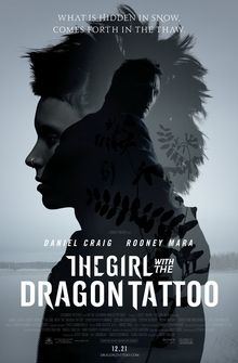
A screenplay or script is a written work by screenwriters for a film, video game, or television program. These screenplays can be original works or adaptations from existing pieces of writing . In them, the movement, actions, expressions and dialogues of the characters are also narrated.

examples of scripts from famous films:
   STAR WARS
 
                                       EPISODE VII

                                    THE FORCE AWAKENS


           Luke Skywalker has vanished. In his absence,
           the sinister FIRST ORDER has risen from the
           ashes of the Empire and will not rest until
           Skywalker, the last Jedi, has been destroyed.
           With the support of the REPUBLIC, General
           Leia Organa leads a brave RESISTANCE. She is
           desperate to find her brother Luke and gain
           his help in restoring peace and justice to
           the galaxy.

           Leia has sent her most daring pilot on a secret
           mission to Jakku, where an old ally has
           discovered a clue to Luke's whereabouts....


          PAN across the star field to a bright moon. A RUMBLING is
          FELT. A VAST STAR DESTROYER -- unlike any we have seen --
          HURTLES PAST US, of seemingly endless length, eclipsing the
          moon. After a long beat, FOUR TRANSPORT SHIPS fly from a
          hangar. We HOLD ON THEM NOW, as they fly off toward a distant
          planet. Jakku. MUSIC BUILDS AND WE...

          CUT TO BLACK.

          A GROWING ROAR of MEAN ENGINES -- gnarled RADIO CALLS, the
          SHUDDERING of a ship's hull. Then FLASHES OF LIGHT: for an
          instant we see a STORMTROOPER -- then BLACKNESS. Then ANOTHER
          STORMTROOPER, then it's gone.

          The FLICKERING CONTINUES until the LIGHTS ARE CONSTANT. We

                         ARE IN:

          INT. TROOP TRANSPORT VEHICLE - NIGHT

          TWENTY STORMTROOPERS. Holding on at attention, moving to
          the ship's rhythm, in the tense moments before a raid. A
          FILTERED COMMAND and they LOCK AND LOAD their heavy blaster
          rifles. The BRUTAL NOISE is replaced by SUDDEN, SHOCKING


                            THE FAULT IN OUR STARS


                                  Written by

                      Scott Neustadter & Michael H. Weber


                             Based on the novel by

                                  John Green


                                                          May 1, 2012

                                                          FIRST DRAFT


          HAZEL GRACE LANCASTER (16) lies in the grass, staring up at
          the stars. We're CLOSE ON her FACE and we hear:

           HAZEL (V.O.)
           You have a choice in this world, I
           believe, about how to tell sad
           stories.

          CUT TO a SERIES OF QUICK IMAGES:
          - Hazel and the BOY we will come to know as AUGUSTUS "GUS"
          WATERS (17) at an outdoor restaurant in some magical place.
          [They look very much like the perfect Hollywood couple.]

           HAZEL (V.O.)
           On the one hand, you can sugar coat
           - the way they do in movies and
           romance novels.

Tuesday, 8 March 2016

Location Scouting

 When finding a location there were a few problems, which was really frustrating! Originally we wanted to film in a house in London and have shot of john playing 'The agoraphobic' looking out onto the busy streets. However, when my partner Cordelia and I started sharing ideas and thinking more realistic about the filming we came to the conclusion that having London as the location may not be the best of ideas.
Reasons why not to film in London
Originally I thought London would be a great place to film as it has lots of interesting places and great filming opportunity amongst the city however the negatives outweighed the positives for filming.

Negatives
  • To start off with me and partner didn't know anybody who lives in London. As we didn't know any house to shoot in we looked online at filming sets. From some of the photos on the websites the houses were beautiful and just what we were looking for, because we're both students we thought we'd get the studio at a very cheap price as we only needed it for a day. However, after a phone-call to the manager of the business the prices he was offering were ridicules and way over our budget! so we immediately scraped that idea.    http://www.shootfactory.co.uk/locations-london-houses.html (link to the Shoot Factory website)
  • Getting transport to London can sometimes be difficult and pricey!
  • When filming if me and my partner miss something out or have to re-shoot we wouldn't be able to do it as easily because we would either have to arrange the date in advance or one of us would have to go up there on their own.
  • The people around us can be a big issue as they can unpredictable and may not want us filming the back of them.
  • Would our actor be willing to go all the way to London?
Positives 
  • There are amazing arsty places you can film and explore in London
  • You would be able to see a big contrast between the lonely house of the characters and the people rushing on the claustrophobic streets
  • We could make the reasoning to him not wanting to leave his house because of something that happened to him on the streets
  • We could also background score the music or the people chatting to themselves in the crowds 
As you can see its not worth us even attempting to film there. To be honest we could always film the streets of our local town (Maidenhead) as it would have the same impact. Also our audience watching won't even be able to tell the difference between the two. I think filming in London just sounds 'cooler' and more professional, when actually its not really ideal for both of us and our actor.

Inspiration
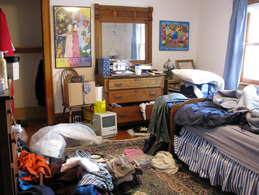
 These are types of settings i'm looking to recreate.I want my characters house to be quite cluttered and considered old fashioned. I thought it would be a good idea to try and find a house with white walls therefore the clutter inside looks more obvious. A big statement i'm looking for is a bookshelf as my character reads a lot.
 The only difference between my house and the inspiration photos I collected is that I want the house to be tidy, I don't want the characters image to be of lower class as I don't want it to distract you and take away the impact of his illness. I just want him to have a lot of items in the house from years of collecting and hording.

The next stage of Location Scouting

After dealing with the massive palava about London we thought it would be best to leave the location scouting for a couple of days just give us a break and to make us think sufficiently. We thought we'd go back to the basics and ask to look at friends/families houses between us. To much of our surprise the first person we asked was John our actor. As i'm not that familiar with John I had no idea what his house was like however once he invited me over to look at the different rooms I then realised it was just what I was looking for. 

John lives in a white three story house. The fact that it's three story lets us be able to explore different angles and rooms within it. What I found really interesting and was my favourite feature of the house was the garish cabinets in the kitchen. As they are so bright it makes them look old fashioned and outdated which relates to our character. There are some features of the house which links to my inspiration such as the busy bookshelves and the cluttered dinning room. As the house is North facing the back of the house captures a lot of light which is just what we needed as the majority of shots we are going to shoot will be at the back end of the house.


Shot List 

Shot list also known as shooting schedule.
The purpose behind a shot list is to record the different shots to be filmed. A shot list is normanlly done in chronological order however it doesn't have to be as it's only a draft to let the producer know roughly what shot to use. 
Whats normally included in a shot list
  • Character 
  • Shot Type
  • Camera Movements 
  • Major Actions 
  • Important Objects
Shot Number
Shot Type
Storyboard Number
Shot Description
1
Medium
Low-High
2,5
Introduction shot of ‘The Agoraphobic’ opening the blind in the bedroom.
2
High Angle
3
Hands rubbing together.
3
Slanted
Low level
4
Focus on the shoes at a slanted angle so it makes you feel tense.
4
Horizontal
High Low
Panning Shot
6
Establishing shot of the house.
5
Medium-Shot
7,9,10,12
Medium shots of different rooms.
6
Panning Shot
8
Panning shot of the outside window.
7
Close-Up
Low Angle
11
Focus on the books on floor to show he has a lot of spare time on his hands.
These are the current shots we are going to use for our final piece. We plan to explore a lots of different angles as the man is suffering from Agoraphobia and is in a rush and a panic. For the majority of shots we are looking to make them jerky and at a fast paste. As each shot will be relatively quick it will hopefully create enigma as we wont be watching the clip for long which will hopefully make it more tense.

The issues which we may have is that we don't want to over complicate the shots as it may make the movie seem more like as film trailer and not unfolding a story. Also, when we first make the shot list we didn't include many panning shots. Most of the clips were originally still shots of the man moving to different parts of the house which we then realised would make the film opening feel too jumpy and hard to understand.