Typography
What is typography?
Noun
The style and appearance of printed matter.
The art or procedure of arranging type or processing data and printing from it.
As we are to create an opening to a film typography needs to be used for the production company, opening credits and film title.
Typography is very important as it a visual language. It gives the audience a direct message to what genre the film is and a vague understanding to what the film will be about. As the saying goes, typography speaks louder than works!
Sinister film opening:
 |

One of the many popular iconic Thriller/Horror films is sinister. Everything about the typography on the film poster and the opening credits has been used to create the emotion of fear and terror. The typography on the poster on the left is bold and spaced out which suggests that the film will have powerful/ striking moments within it. Also, the writing
shadows underneath the letters suggesting that its meant to relate to blood which would foreshadow the blood bath scene later on in the movie.
The typography on the opening film clip is very small and positioned towards the right of the screen. As the writing is not center of the image and is smaller than most film opening credits is because the director has wanted the viewers attention to be on the people and not the writing. However to make the writing stand out a special text box is used around it, enhancing of what you can see of the writing. The typeface used within the text box looks vintage indicating that the scene is dated.
Inspiration of typography used for thrillers:
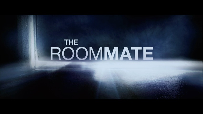
The positioning of the film title is very clever here. the reason why I like it is because the word roommate has been divided into two different words by the use of the boldness which implies the film is going to be about friendship. The colour of the writing also contrasts against the black/blue tones of the doors making the opening title look powerful.
Thinking ahead
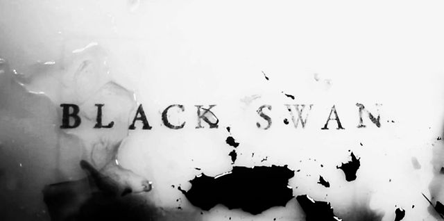
When looking at these few movie titles what I think is really successful and would fit perfectly in my upcoming project on Agoraphobia is the contrast between the background and the colouring of the Typeface in the titles, as they stand out more. what I also like is the way the letters are spaced out and have been put into upper case lettering, I think this would have a great look on my film as it is being based about a man suffering with agoraphobia so the individual letters can reflect his independent ways of life and how controlling the condition can be, and by using upper case letters it would show to the audience that it is a important and powerful film about something serious and very heart hitting to some people.
After hours of me and my partner 'Cordelia' being undecided about a Typeface we finally came across one which would fit best into our movie genre. The Typeface in which we are currently going to go by is called 'Baskerville'. We specifically chose this font as its thin lettering create a classic English look which suggests that his metal issue is of a serious matter.
Like I mentioned earlier we want to incorporate the other titles use of spacious letter into our opening. We plan to put the lettering center of the image so it portrays of how overwhelming the condition is. However, unlike the other movie scene we decided we don't want to make the font as bold because we still want the audience to be interested in watching the man and not just the Titles.


No comments:
Post a Comment